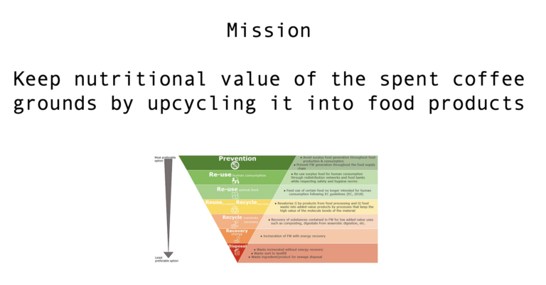
Connecting Grounds is an NGO founded in 2021 with the aim to revolutionize the coffee industry. It’s a fresh startup with just a few people in charge without hierarchical belief.
Lacking the target group, awareness, and strategy on how to proceed in launching their concept, we dig deeper to find the problem statement which was:
How can we help increase the awareness of CG, help them be more recognizable, strengthen their digital presence, & expand their customer base?
Approach
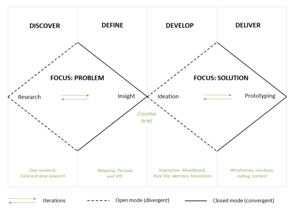
To ensure the best possible experience and offer the most valuable digital solution, we chose the Double Diamond framework. That helped us also properly manage our team work and time frames.
Client Analysis
To best comprehend the client, as a group, we conducted desk research and had meetings with the CG team throughout the entire process. As a fresh startup founded in 2021, they had barely any presence in the digital world. Only on LinkedIn, CG sometimes posts. CG’s Instagram is, on the other hand, active but the team was still struggling to establish a proper digital presence and a customer base.
Secondly, conducting interviews with the CG team, got us to have a clearer picture of their aims toward their users with their values, mission, and vision.
Thirdly, CG’s behind-the-scenes insights about its similar competitors and an ongoing process of establishing its presence gave us a clearer and deeper image of how CG wishes to communicate itself to its audience.
User Analysis
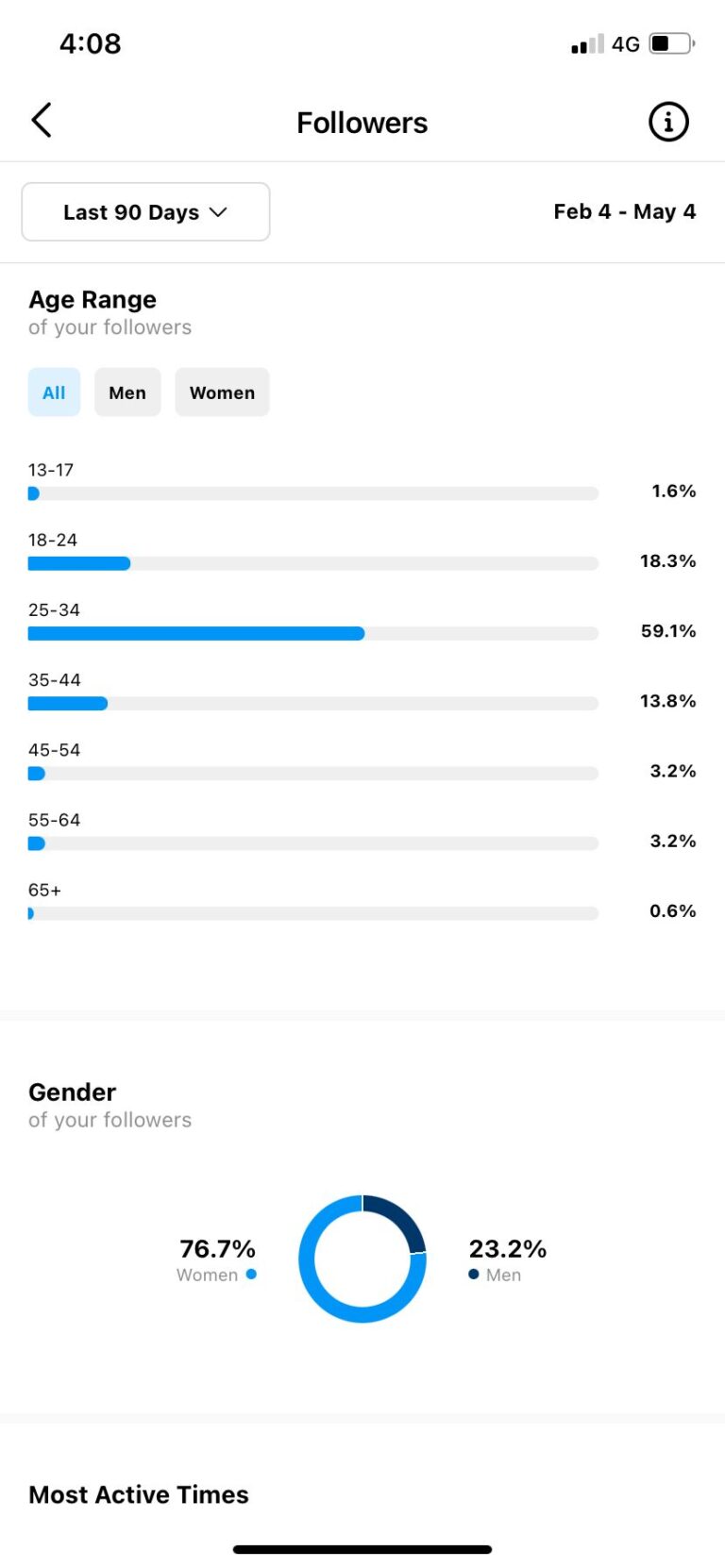
In order to best communicate CG’s aims, we conducted qualitative and quantitativeresearch to initially find out and create CG’s target audience. SoMeresearch and Netnography allowed us to truly define what kind of relationship and why the users have toward sustainability and coffee and their connection.
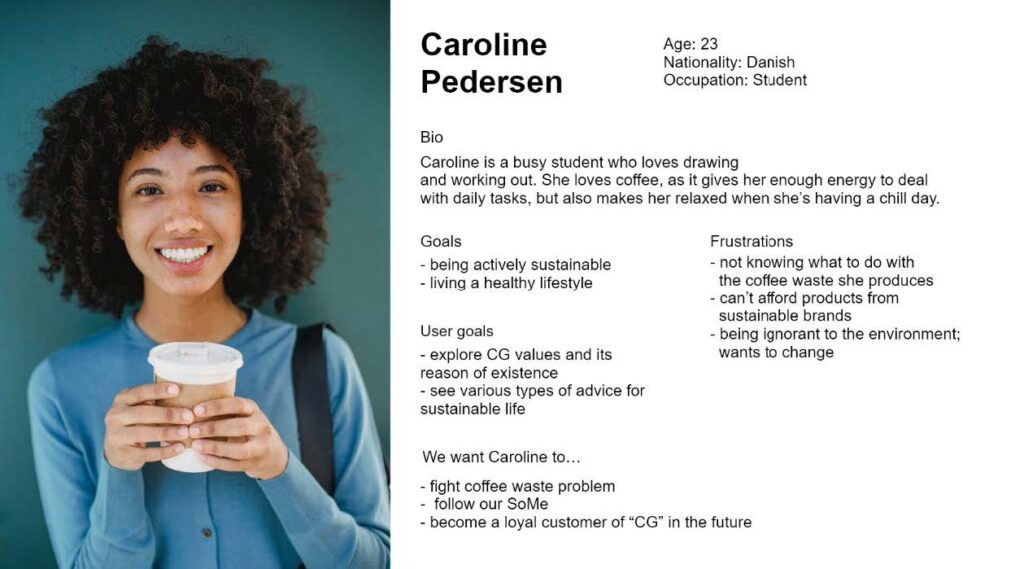
The target group consists of students on a budget who aim to contribute to sustainability. As well as being dependent on coffee and loving it as a daily hygge. Based on our insights, we created our main persona. We focused here mainly on business objectives, user goals, needs, and frustrations. To properly understand the audience and talk to them to their heart, we created a tone of voice.
Problem Analysis
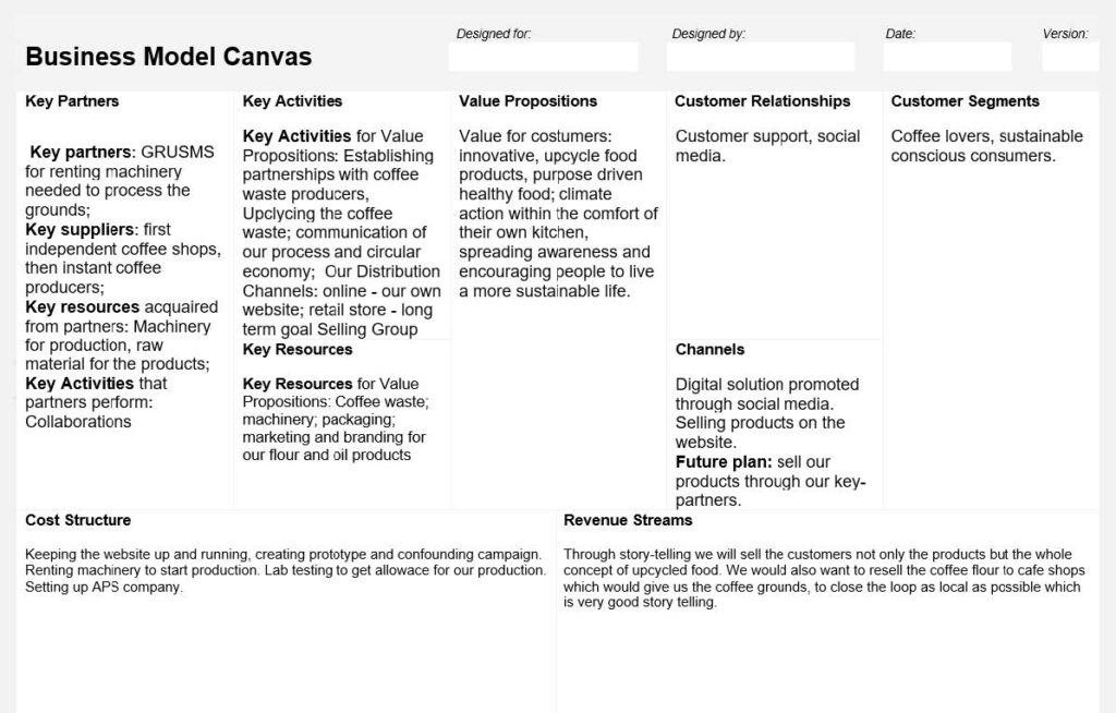
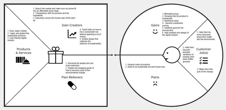
Continuing the research, the Business Model Canvas allowed us to define what key elements CG needs to exist and what it can offer to its audience. Value Proposition Canvas opened the way to analyze and define pains and gains for our users in connection to our client.
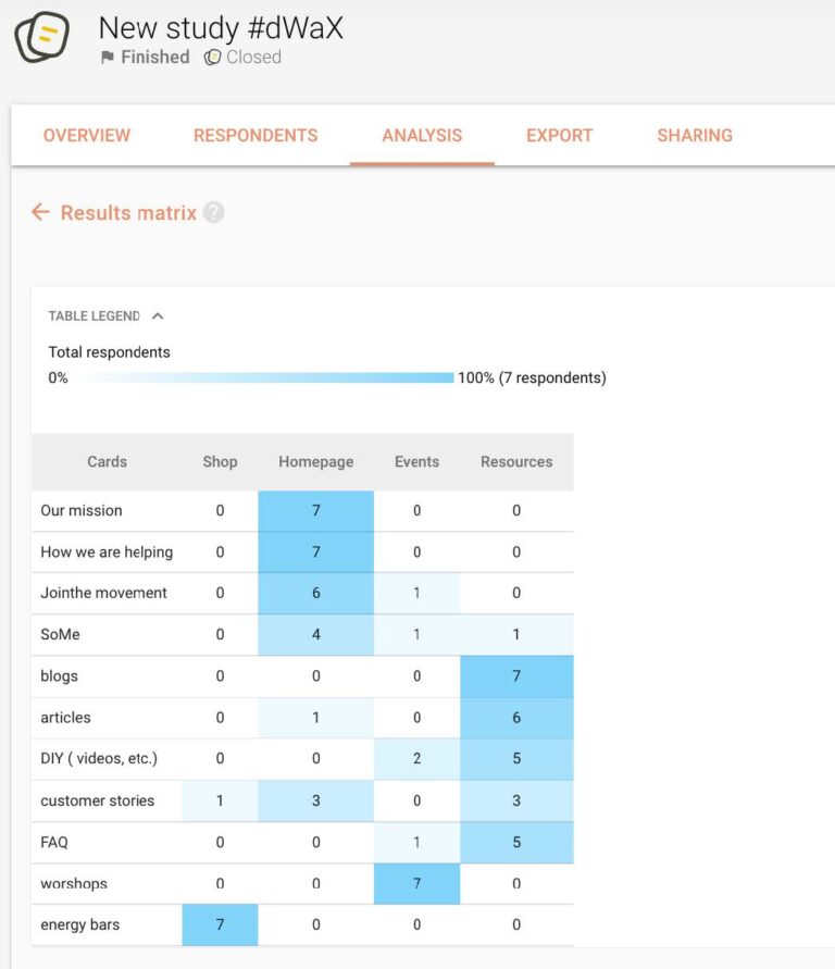
These two methods determined subsequently CardSorting method options. After the Open round, the Closed Card sorting proved the similarities among users perceiving potential content and categories.
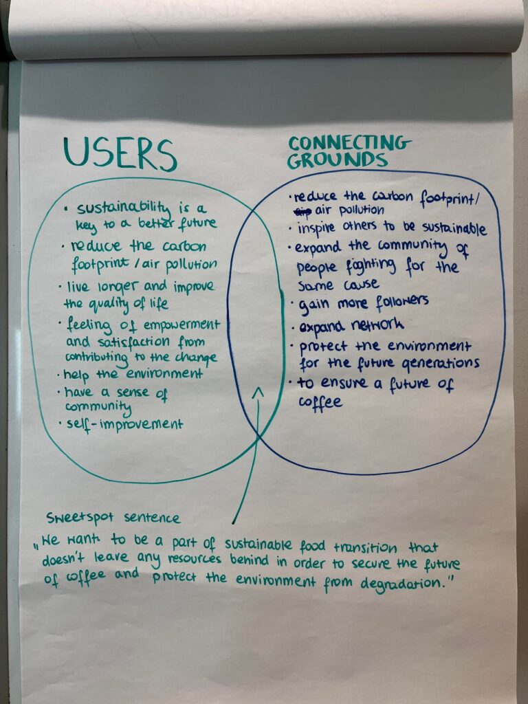
Lastly, we created Sweetspot to appropriately adjust the content for both parties. This method reassured us that both parties’ goals overlap.
Concept Development
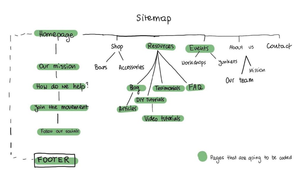
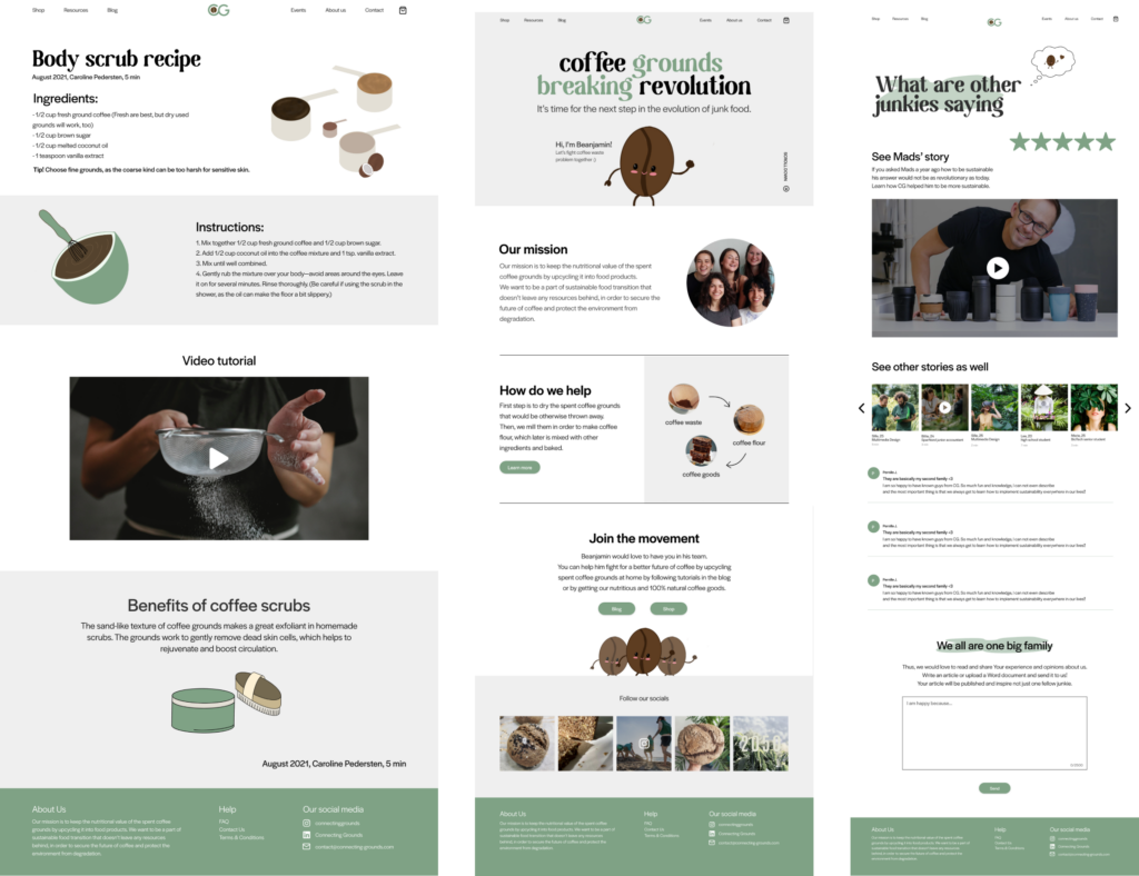
To kick off the building of our digital solution, we brainstormed a concept map with features and content. CG’s strength is storytelling which was the foundation for our digital solution. After that, we created a Site map. That was approved by CG as well and they were super happy to be on the same page with us all the time.
Lastly, we created a User flow. which allowed us to map how the users would navigate through our solution and avoid dead-ends.
Due to the fact, CG was practically a ‘newborn’, we had to dig deeper and do more in-depth research to make sure to deliver a proper head start. That was part of the process which I enjoyed the most.
Design Ideation
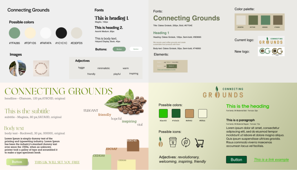
After having our problem and client analysed in-depth, we created moodboards. Creating several of them, we then chose a direction which we should take. After that, we created a style tile which guided us through the whole process.
Design Development
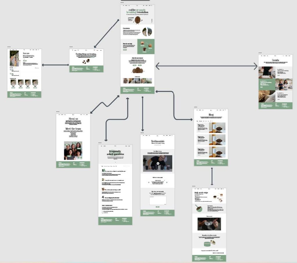
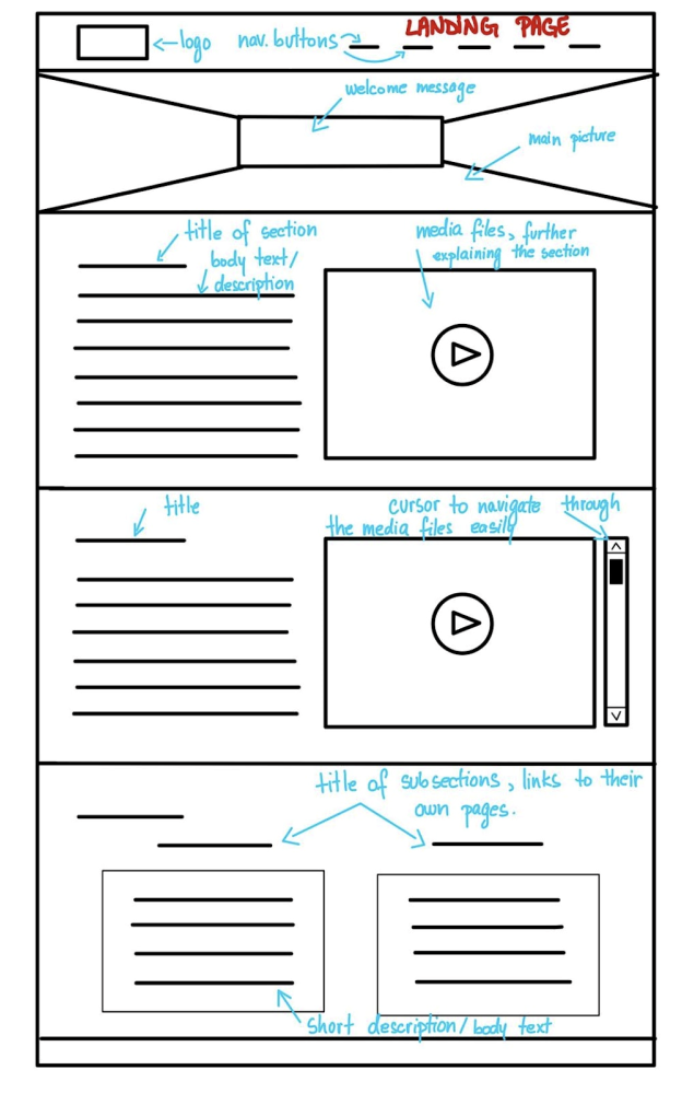
After seeking inspiration, we createdsketches that transformed intowireframes. Sketches helped us visualize the content layout andwireframesembellished our vision. These two steps helped us keep in mind the visual hierarchy and keepconsistency.
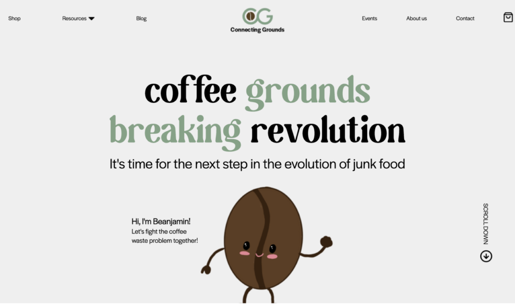
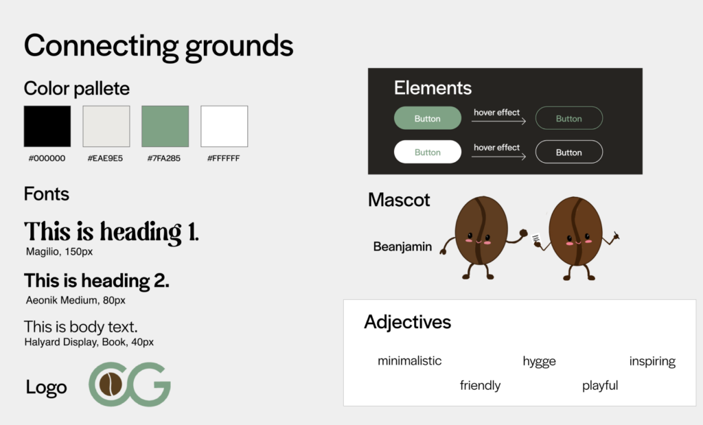
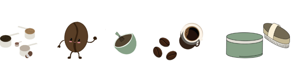
Another step was creating a new logo to symbolize the recycling state which is an interrupted infinity loop. After the logo, we created a mascot ‘Beanjamin’. They represent the diversity and welcomingfeeling of CG. Consequently, we created also different illustrations for a more personalized feeling in Adobe Illustrator and ProCreate.
Prototyping
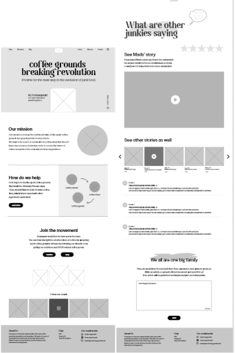
After having our wireframes done, we created mockups. Our digital solution got a breath of life and we finished prototyping it into a functional website. Creating a live version of our digital solution allowed us to test it on our users. Because the structure was simple, we were able to test the prototype version. The insights were satisfying, as the users showed only different variations of changed structure.
Final thoughts
After finishing our prototype, we met the requirements in order to fulfill the problem statement. Thanks to our in-depth research, we were able to reflect CG’s visual and business identity.
I enjoyed this project far more thanks to the importance of a thorough research and my beloved team. We had a blast time and learn so much about cooperating with each other. The most important skill was to communicate everything straight forward and bear, that no matter the friendship, we need to keep it professional and honest.